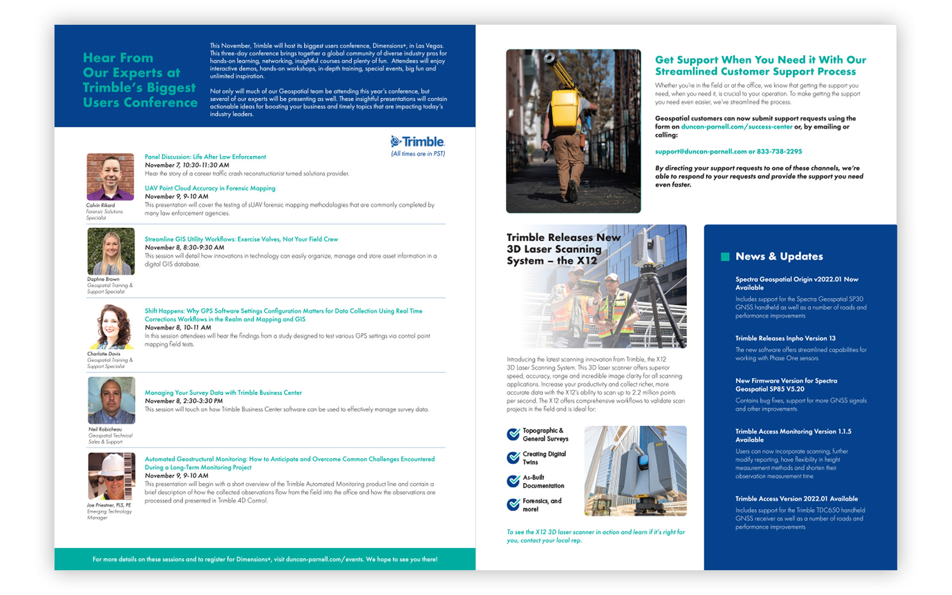
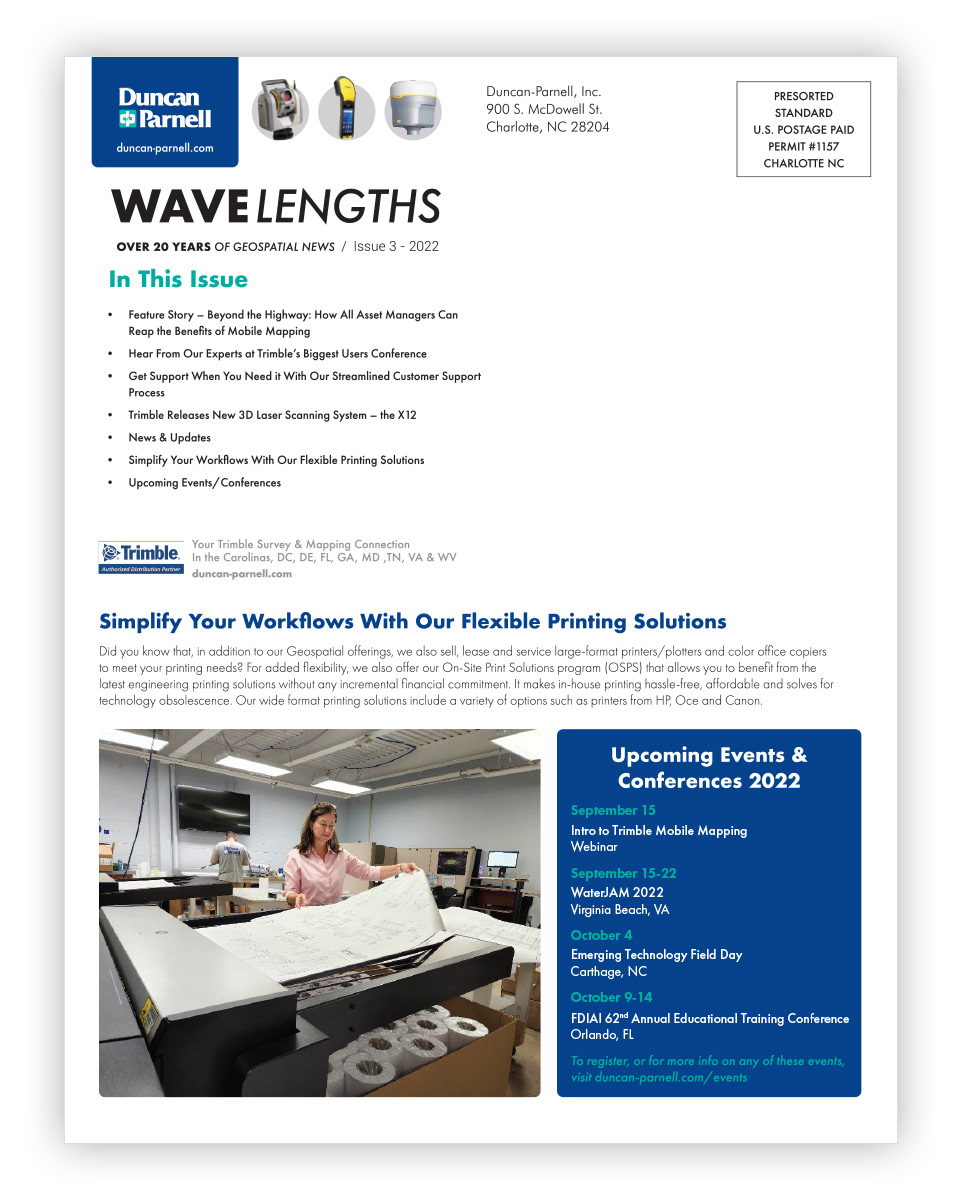
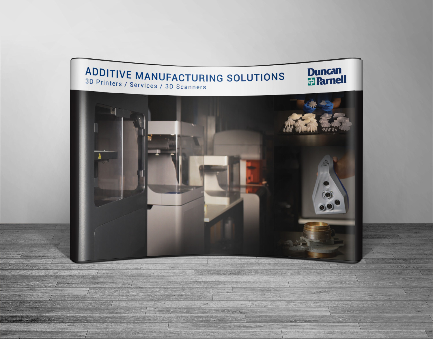
Each quarter I have the privilege to design Duncan Parnell's newsletter. The marketing team at D.P. supplies me with content and photos and then I design the layout in Adobe InDesign. I also use Photoshop to edit photos, remove backgrounds, etc. as needed to help zhuzh up the look.
After our final revisions, I then outline the fonts and export two PDF versions. One that is print-ready with crop marks and one that is small enough to share on their website without losing image quality.
When I was first hired for this project, we completely redesigned the look and layout to fit their brand standards while also giving a fresh and modern feel.

